Logo Designs
“The right logo says everything without saying a word.”
Logo designs serve as the visual representation of a brand, encompassing its identity and values in a single emblem. A well-crafted logo is instrumental in creating brand recognition and establishing a strong presence in the market. It encapsulates the essence of a business and communicates its message to the target audience effectively. Through color, typography, and imagery, logos evoke emotions and perceptions that shape consumer attitudes towards the brand. In a saturated market, a distinct and memorable logo can make a significant difference in standing out from competitors and building a loyal customer base.
I had the opportunity to create logos with two companies that trusted me in helping them create a visual representation of their new business adventure.


JJG Vending Services
Chandler Flurry from Flurry Vending, now JJG Vending Services, reached out to me during the Pandemic in 2020 asking if I could create a logo for him. During this time, I was doing anything to be creative while being stuck in the house. We discussed what he had in mind originally for a logo.
Since this was his first business venture, he wanted to stick with his last name. Along with the simplicity of his business name, he wanted the logo to be simple as well. We decided to incorporate a snowflake due to the association with his name. From there, we added blue to incorporate color and to tie in the snowflake. He also needed informational stickers made to have on his machines, which I created with my Cricut.
It’s now 2022, and Chandler reaches back out stating that he is rebranding his company due to gaining a business partner, so we had to think of a new logo for JJG Vending Solutions. This time, he just needed a simple logo because he knew a rebrand would happen again in the future. To fit the tall, narrow, square looks of vending machines, I went with a font that could mimic the machine’s shape and the font used on the payment readers.
2024, I receive an email from Chandler stating that he is going through another rebrand. He wanted to still incorporate the previous design, but include a vending machine into the logo. After some ideation, I was able to visualize a vending machine utilizing the G, and to make the logo compact, we agreed to have the business name stacked. JJG Vending Services is a prime example that branding is always evolving.
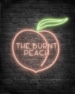
The Burnt Peach Picnics
2020 to 2021 was the time of new business. During the Pandemic, many individuals took the time to venture in small businesses they always dreamed of starting. The same motivation happened to Iliana McDonald. With her knowledge in event coordination due to her experience prior to the Pandemic taking place, she decided to start her own event planning business, where she creates small intimate picnic settings. Iliana knew before discussing with me that she wanted her business name to be The Burnt Peach Picnics. After a brief conversation with her, she wanted her logo to have the aesthetic of a neon sign. Neon Signs are simple in their design because the lighting effect is what truly draws the viewers attention. So I decided to do a simple peach and the business’ name. To this day, Iliana utilizes the neon peach logo to identify her events.